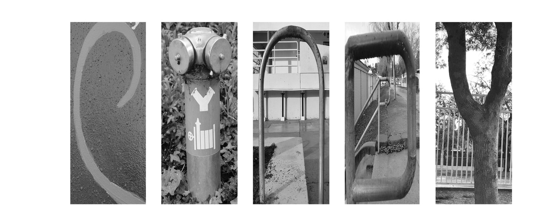
 I edited the photographs in black and white after that I opened up a white background on photoshop and I lined up all the images and made them the same size.I adjusted the brightness and contrast so they can look almost the same. I struggled on making the pictures look the same black and white. The steps I was proud of figuring out was transforming the image to make the letter. What I like best about my artwork is how my name is clear. I think I could have improved on being more creative with the letters.
0 Comments
Leave a Reply. |
AuthorJunior at RBV. Archives
May 2017
Categories |
 RSS Feed
